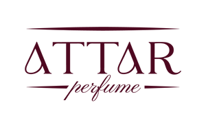

ATTAR is getting a new look. Over the coming months you will start to see our new logos on the website, on our boxes and on our bottles. What is inside each bottle does not change.
The letter A: our main mark

From now on, the single letter A is the main ATTAR logo. Its curved side is drawn as a drop, the way every attar is worn: a drop at a time. This is the mark you will find on the front of our bottles and boxes.
ATTAR: our wordmark

The full name, ATTAR, is our wordmark. It is the logo you will see across our website, on labels and in our emails. Look closely and you will see that both letters A carry the same drop.
Why your bottle may look different
We are moving to the new design step by step, so for a while the old and the new will sit side by side. Some photographs on our website may still show the earlier bottles, and the bottle you receive may look different from the one in the picture. That is the rebrand, not a different product: the oil inside is the same.
If you have any question about your order, just get in touch and we will be glad to help.
Coming soon: Draco, Extrait de Parfum

One of the first pieces to carry the new identity is Draco, an extrait de parfum from our upcoming perfume collection. The A sits on the front of its box, filled with a deep red, and the ATTAR wordmark is on the bottle. Draco is coming soon, and we will share more as soon as it is ready.
Thank you for being with us through this new chapter.
Share:
The Vanishing Scent: A Quest for the Soul of Oud